Case Study: Serra. Identity and Product Design for Financial App
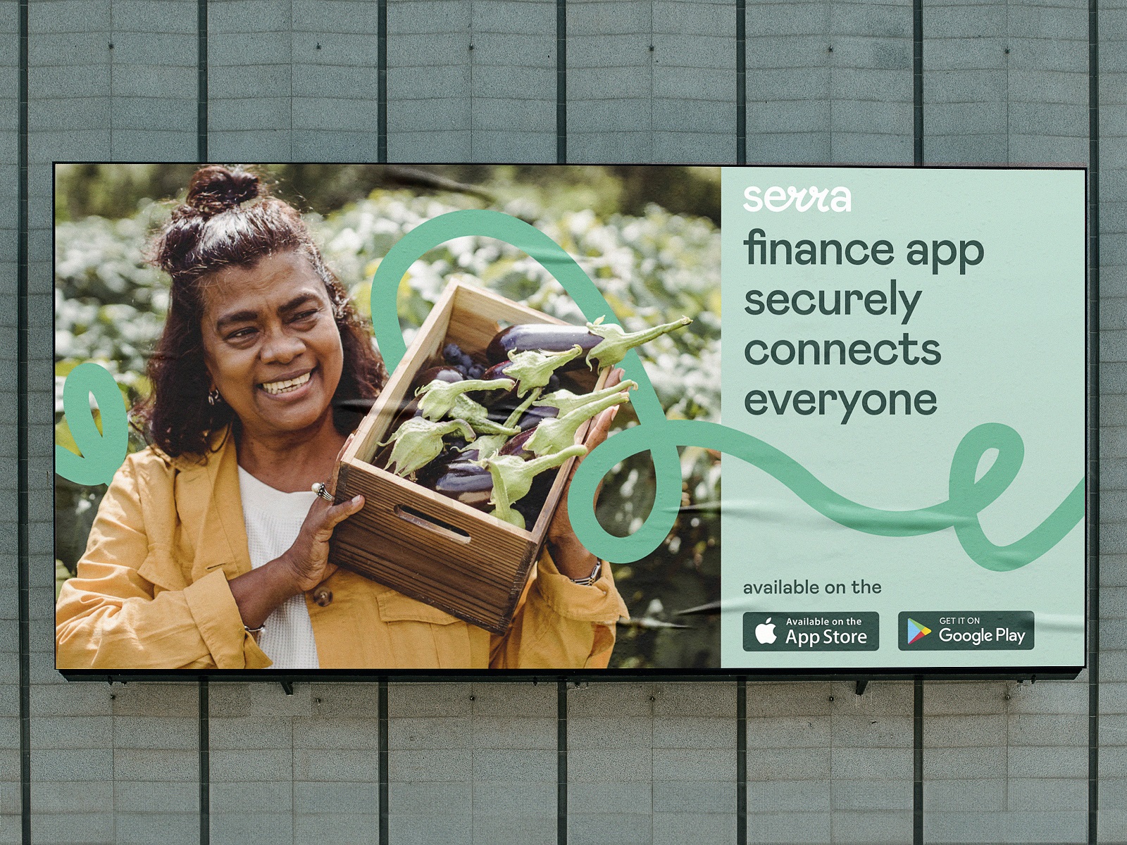
This case study presents one more fintech project in our portfolio: here, we invite you to take a glance at the brand identity and product design created for the financial application Serra. Client and Project Serra is an iOS/Android app that aims to build a culturally aware financial application from the ground up in Montserrat (the Caribbean region) by solving locals’ real-life challenges. Serra’s goal was to create a mobile finance ecosystem for Monserrat locals. The target audience is not quite used to mobile banking and sees banking as a rather complex and unapproachable service. So, our task was to create an identity and product design that would be welcoming, user-oriented, not complicated, and very approachable. The creative team from the tubik side included Vladyslav Taran, Anton Morozov, Anton Chyrskyi, Roman Chornyi, Mykyta Litinskyi, Kirill Erokhin, Ladamyra Kunytsia, Olya Zakharyan, and Anastasiia Iliashevych. The project’s scope involved creating brand identity, web design, product design, and motion design. To cover it, we took the following steps: researching and analyzing the common money transaction patterns of the Monserrat local designing a friendly and emotionally appealing brand identity emphasizing the simple and amiable nature of the service developing a set of graphic elements that imitate hand drawing, which adds a human touch to fintech designing an intuitive mobile application with QR-code-based P2P and merchant payments creating a website based on the key identity element of a ribbon, which represents continuous money transfers Identity Design The brand identity design was based on the analysis of the target audience’s needs and features, which in this case were quite specific due to the fact that the service aimed to be fine-tuned for a local community that was not accustomed to cashless operations and digital finance management. So, the brand image strived to be perceived and was built around a set of characteristics such as reliability, friendliness, speed, modernity, flexibility, and accessibility. The visual identity should be clean and straightforward, employing modern typography and lifestyle photos. The brand logo was created to be bold, minimalist, and legible in various sizes. It is a wordmark featuring the brand name and mixing typographic and calligraphic approaches. The calligraphic curves added an association with handwriting, making the logo more emotional and closer to users. The color palette is close to nature and shares vibes of trustworthiness and friendliness, with a bunch of greens and a contrastive orange color for visual accents. The brand typography choice fell on neat and readable Mabry Pro. The calligraphic element adding a pinch of uniqueness to the logo design also became a basic for the graphic doodle visually associated with a kind of ribbon or wave and uniting all the elements of brand communication, from logo to marketing graphics, product design and web design. Another important visual element of branding was the approach to photo content, which aimed to add a human element and set a strong emotional connection with the users. Here’s what it looks like and how it works at different touchpoints. Outdoor advertising banner design Social media marketing approach Social media marketing approach Mobile Application Design As the core target audience was quite limited and clear in its preferences and background, » Read More
Like to keep reading?
This article first appeared on sidebar.io. If you'd like to continue this story, follow the white rabbit.